
iTEAR
Dry Eye Syndrome Reliever
PROJECT INFO
Brand | Arctic Vision
Design | frog design
Year | 2022
ROLE & SKILL
Lead Design Strategist | Market research, User interview, Insight synthesis, Design principle & strategy
Industrial Designer | Ideation sketch, 3D modeling, Rendering, CMF design, Prototyping
Packaging Designer | Ideation, structure design, 3D modeling, Rendering, Manufacturing support
Revolutionary Technology
For A More Friendly DES Treatment Experience
iTEAR equipped with evolutionary technology to restore natural tear production, allowing it to use non-invasive technology to stimulate the external nasal nerve to promote natural tear production. It's a breakthrough product to DES (Dry eye syndrome) patients and has been clinically proven to effectively relieve dry eye symptoms.

Penguin- Your lovely buddy for ocular care
By transforming the typically cold, clinical aesthetic of medical devices into a friendly, penguin-inspired form. This playful yet functional transformation creates a more positive product experience, effectively reducing the emotional stress often associated with personal medical care.

_Resized.jpg)

Skin-friendly and comforting
Through the use of soft, stain-resistant silicone material and a rounded design language, we offer users a more comfortable and reassuring experience.

Guided by material,
intuitive to grip.
The primary contact areas are made of silicone material, guiding the grip gesture while being seamless and stain-resistant.


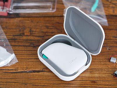
Carrying and keeping it hygienic effortlessly
Considering users' daily routines, carrying the product in bag or pocket is inevitable. The case allows users to store it without worrying about dirt or damage.


BRANDING & DIGITAL EXPERIENCE
Make the burden-free treatment experience
go beyond industrial design aspect
Beyond the hardware, iTear’s packaging and digital interface were unified under a newly developed Visual Identity (VI) system. To support a global launch across seven markets, the project involved delivering three distinct VI frameworks, two packaging systems, and two app iterations.

Merging reliability with playfulness
While aligning with the general expectation of professionalism and reliability in medical products, we incorporate playful elements through vibrant color and irregular shapes to create a pleasant brand image.


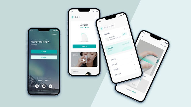
Easy navigation with card-based design
The card-based information design reduces browsing effort, allowing users to access information at a glance and making the experience more intuitive and streamlined.
PACKAGING DESIGN
Elevating the medical unboxing experience
The packaging strategy aims to dismantle the sterile, negative perceptions of traditional medical devices.
Three concepts were developed, each offers a unique structure and unboxing ritual, transforming a
clinical necessity into a premium consumer touchpoint.


CHALLENGE
Reimagining the product experience without changing core structure
As per FDA’s limitation on structural aspects of DES treatment devices, there was few space left for an identical innovation on the iTear product.
"Instead of redesigning everything, we should identify and reshape the most critical part of the experience to DES patients. "

The original product
KEY INSIGHT
The hidden mental burden of dry eye syndrome
The impact of Dry Eye Syndrome (DES) is dual-fold: a cycle of chronic physical irritation and escalating mental distress. Research also indicates that over 36% of DES patients experience depression or neurological sensitivities, conditions often exacerbated by clinical, intimidating, and unhygienic hardware. This insight shifted our mission from basic utility to emotional comfort. By prioritizing an "anxiety-free" design philosophy, we replaced negative triggers with a sensory experience rooted in joy, hygiene, and user reassurance.


DESIGN THEME
Strategically explored within three directions
according to the key experience principles
Guided by three vital insights from research, our design journey was defined. The first insight, 'Delightful soothing,' sparked calming aesthetics and user-friendly interactions. The second, 'Effortlessly Hygienic,' prioritized cleanliness and convenience. The third, 'Reassuring to use,' seamlessly integrated concepts for enhanced usability. With these insights, our concepts promise impactful user experiences.


PENGUIN
CONCEPT EXAMPLE
Comforting at first glance, even better to use.
DELIGHTFUL COMPANION
Creating enjoyable product experience to sooth the users' anxieties.


CUBIC
CONCEPT EXAMPLE
Easy to clean, easy to carry, freedom on the go.

Prioritize cleanliness and sense of hygiene for a burden-free experience.
CAREFREE CLEAN

PEBBLE
CONCEPT EXAMPLE
Pure elegance,
zero effort.

Easy and unobtrusive use allows the users to feel comfortable and at ease.
ELEGANT TECH
METHODOLOGY
Analogous research and prototyping for tangible input
To navigate the challenges of a novel product category, we utilized analogous research to ground our interviews in tangible experiences. This was followed by hands-on testing with low-fidelity prototypes, allowing us to observe in real life and uncover critical issues and opportunities that would have remained hidden in a purely verbal interview.


Talk about analogous experience
By referencing familiar product categories, we enabled users to articulate their behaviors and mindsets with greater clarity.


Prototypes for user validation
Low-fidelity prototype is the best way to validate concepts.

Cross-validation to uncover true opinions
We cross-referenced user ratings and feedback for each concept to gain deeper insights into their true preferences.


Design validation through DVT
After concept selection, we collaborated with engineering to build functional prototypes for Design Validation Testing (DVT), verifying mechanical feasibility and ensuring the user experience.
CREDITS
Brand
Arctic Vision
Design
frog design
Team
Mingmin Wang, Kuo-Chieh Wang, Ajax Wang,
Sue Su, Qingbei Wang, Chloe Wang, Muzi Yang
Photo Credit
Arctic Vision